Opens the full working site
The design challenge
What this site had to solve.
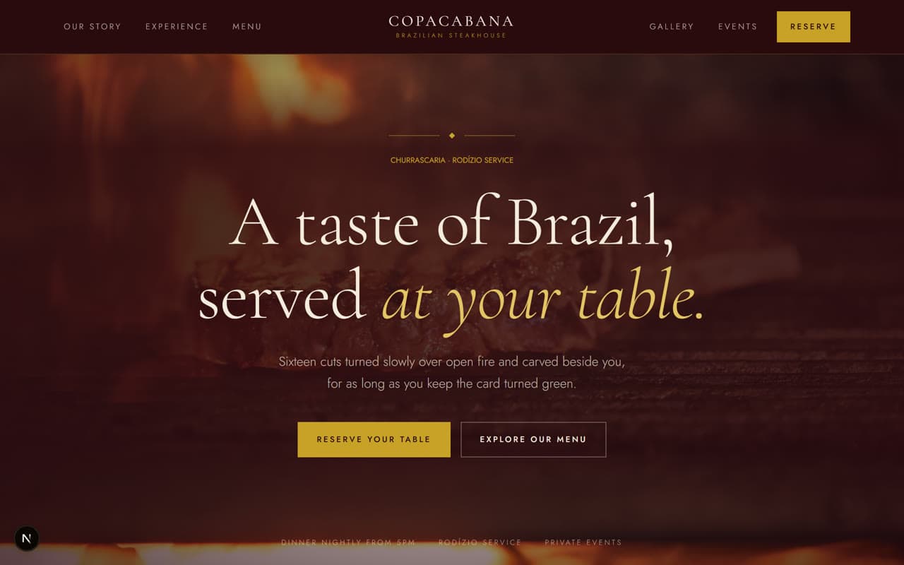
Nobody books a steakhouse from a menu PDF. The decision is made on atmosphere — light, warmth, the sense of an occasion — and most restaurant sites flatten that into an accordion of opening hours. This one had to feel like the room before you've walked into it, and then make reserving a table effortless.
Creative direction
The decisions behind it.
- Deep burgundy and forest green under warm gold, lit like a dining room after dark
- High-contrast Cormorant serif at editorial scale against a cool geometric sans
- Full-bleed cinematic imagery with slow parallax rather than a static hero
- The churrasco service as a narrative sequence, not a feature list
- Menu set as an editorial column with dotted leaders, the way a printed menu reads
- Reveal-on-scroll via clip-path, so images uncover rather than fade
Key features
What's actually built.
Every item below exists on the live demo — you can go and use it.
Reserve a table as a persistent primary action, secondary to nothing
Signature cuts presented as a horizontal editorial gallery
Menu laid out as a printed card, in courses rather than tabs
Private events treated as a distinct enquiry path
Location, hours, and parking answered without a click
Desktop & mobile
Designed at both ends.
Every layout here was drawn on a phone first and then opened up, rather than squeezed down from a desktop mockup afterwards. Nothing is hidden on small screens, and nothing scrolls sideways.
Technologies used
Want something like this for your business?
Email us what you do. We'll come back with a direction, a scope, and a fixed price — in writing, before you commit to anything.