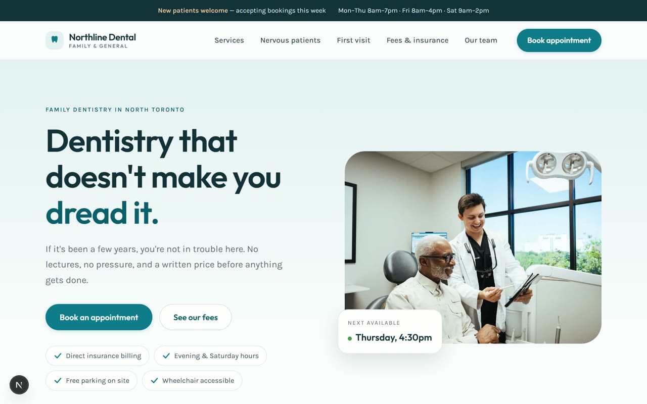
Opens the full working site
The design challenge
What this site had to solve.
Dental is the only industry here where the customer is actively afraid. Somewhere between a third and a half of adults avoid the dentist out of anxiety or cost, so a site that opens with a bright smiling stock photo and a Book Now button is talking past the exact people it needs. This one had to do the opposite: lower the temperature, answer what it costs and whether insurance covers it, explain what happens in the chair, and only then ask for a booking.
Creative direction
The decisions behind it.
- Light and airy throughout — the only demo built on a pale surface, deliberately, because dark and dramatic is the wrong emotional register for healthcare
- Soft teal and warm sand instead of the clinical blue-and-white every dental site defaults to
- Generous rounding on every card, button, and image — nothing sharp, nothing clinical
- Outfit set friendly and open, at comfortable reading sizes rather than editorial extremes
- Motion is slow and gentle: nothing snaps, wipes, or slides. Everything settles
- Anxiety and cost handled as their own sections, above the booking form rather than buried in an FAQ
Key features
What's actually built.
Every item below exists on the live demo — you can go and use it.
Booking as a persistent action, with the next available slot shown so it feels concrete
A dedicated section for nervous patients, written plainly and without reassurance clichés
Insurance and direct-billing answered on the page, not behind a phone call
First-visit walkthrough so a new patient knows exactly what will happen
Hours, parking, and accessibility answered without a click
Desktop & mobile
Designed at both ends.
Every layout here was drawn on a phone first and then opened up, rather than squeezed down from a desktop mockup afterwards. Nothing is hidden on small screens, and nothing scrolls sideways.
Technologies used
Want something like this for your business?
Email us what you do. We'll come back with a direction, a scope, and a fixed price — in writing, before you commit to anything.