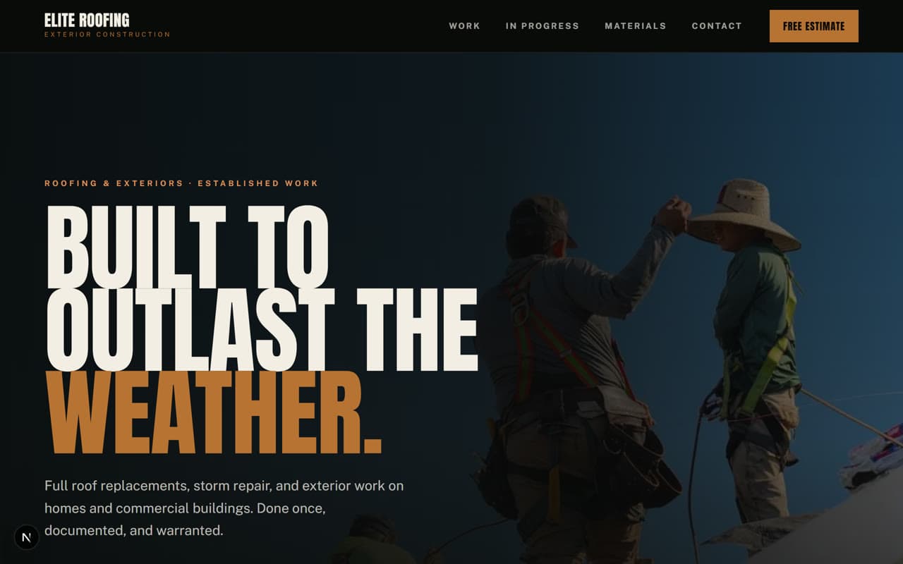
Opens the full working site
The design challenge
What this site had to solve.
A roof is a considered purchase people make once or twice in their lives, and they research it the way they'd research a car. The site had to carry the weight of that decision — scale of work, quality of finish, what happens if something goes wrong — without reading as a brochure. It needed to feel established rather than eager.
Creative direction
The decisions behind it.
- Full-bleed imagery and near-black surfaces, closer to an editorial feature than a brochure
- Anton set enormous and tight, so headlines behave as structure rather than labels
- Diagonal section breaks echoing a roofline, cutting across the grid
- Copper as the only warm note against black and off-white
- Asymmetric layout — content deliberately off-centre, with generous negative space
- Scroll-driven motion: images scale slowly, figures count, panels wipe on the diagonal
Key features
What's actually built.
Every item below exists on the live demo — you can go and use it.
Interactive before-and-after slider, draggable and fully keyboard-operable
Free estimate as the single primary action throughout
Project gallery on an offset grid that breaks the column rhythm
Materials and warranty stated openly rather than buried
Oversized figures used as structure, not decoration
Desktop & mobile
Designed at both ends.
Every layout here was drawn on a phone first and then opened up, rather than squeezed down from a desktop mockup afterwards. Nothing is hidden on small screens, and nothing scrolls sideways.
Technologies used
Want something like this for your business?
Email us what you do. We'll come back with a direction, a scope, and a fixed price — in writing, before you commit to anything.